Decoding the Klasky Csupo Logo: A Deep Dive into its Enduring Legacy
The Klasky Csupo logo. Just those three words likely conjure up a very specific image, and perhaps even a sound, for anyone who watched Nickelodeon in the 1990s and early 2000s. That jarring, slightly unsettling, yet undeniably memorable logo was a fixture, signaling the start of some of the most innovative and influential animated shows of that era. But what made the Klasky Csupo logo so distinctive, and why does it continue to resonate with audiences today? This article delves into the history, design, and cultural impact of the Klasky Csupo logo, exploring its significance in the world of animation and its lasting legacy on popular culture.
We will explore the logo’s design elements, dissect its psychological impact, and examine its role in shaping the identity of Klasky Csupo as a groundbreaking animation studio. Whether you’re a seasoned animation professional or simply a nostalgic fan, this deep dive will provide a fresh perspective on one of the most iconic logos in television history.
The Genesis of an Icon: The Story Behind Klasky Csupo
To understand the Klasky Csupo logo, it’s essential to understand the company behind it. Founded in 1982 by Arlene Klasky and Gábor Csupó, Klasky Csupo emerged as a disruptive force in the animation industry. Their initial focus was on creating title sequences and graphic design for television, quickly establishing a reputation for bold, experimental visuals.
The studio’s breakthrough came with their work on The Tracey Ullman Show, where they animated the original shorts featuring The Simpsons. This collaboration catapulted Klasky Csupo into the mainstream and paved the way for their own original animated series. Shows like Rugrats, Aaahh!!! Real Monsters, and Rocket Power became cultural phenomena, defining a generation of children’s television. The Klasky Csupo logo, with its distinctive aesthetic, became synonymous with these groundbreaking shows.
Klasky and Csupó were known for their willingness to take risks and push boundaries, both in their animation style and their business practices. They fostered a creative environment that attracted talented artists and animators, many of whom went on to have successful careers in the industry. This commitment to innovation and artistic expression is reflected in the studio’s iconic logo.
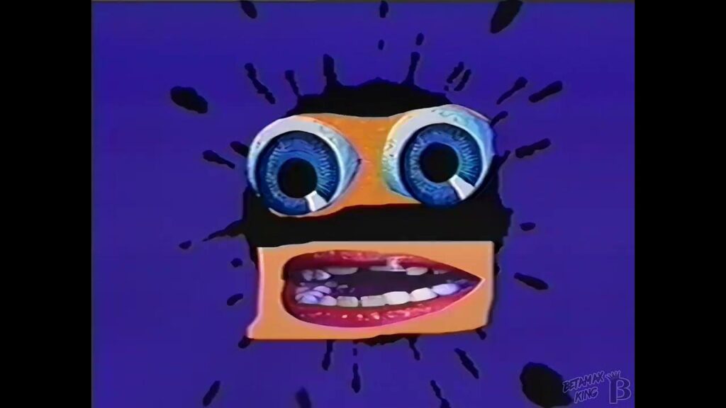
Deconstructing the Visuals: Anatomy of the Klasky Csupo Logo
The Klasky Csupo logo is instantly recognizable, but what exactly makes it so unique? Let’s break down the key visual elements:
- The Colors: The logo typically features a vibrant combination of red, yellow, and blue, often in slightly off-kilter shades. These primary colors are bold and attention-grabbing, reflecting the studio’s energetic and unconventional approach.
- The Shapes: Geometric shapes, particularly squares and circles, are prominent in the logo’s design. These shapes are often distorted or asymmetrical, creating a sense of unease and visual interest.
- The Typography: The Klasky Csupo name is rendered in a custom typeface that is both playful and slightly unsettling. The letters are often uneven and slightly distorted, adding to the logo’s overall sense of quirkiness.
- The Animation: The logo is typically animated, with the shapes and colors shifting and morphing in a frenetic and unpredictable manner. This animation adds to the logo’s sense of energy and excitement.
The combination of these elements creates a logo that is both visually striking and psychologically intriguing. It’s a logo that demands attention and challenges viewers to question their assumptions about traditional animation.
The Sound of Innovation: The Klasky Csupo Logo’s Sonic Signature
The Klasky Csupo logo isn’t just a visual experience; it’s also a sonic one. The accompanying sound effect, a jarring and somewhat dissonant cacophony of electronic noises, is just as iconic as the visual design. This sound effect, often described as a combination of squawks, beeps, and static, is intentionally unsettling, designed to grab the viewer’s attention and create a sense of anticipation.
The sound effect was created by splicing together various sound recordings, including electronic music samples and found sounds. The result is a unique and unforgettable audio signature that perfectly complements the logo’s visual aesthetic. The sound design contributes significantly to the logo’s overall impact, creating a multi-sensory experience that is both memorable and distinctive.
The audio logo, or sonic branding, is critical to brand recognition. Many who grew up watching Klasky Csupo productions instantly recognize the sound, even without seeing the visual logo. This creates a powerful connection to the brand and evokes feelings of nostalgia and excitement.
Psychological Impact: Why the Klasky Csupo Logo Sticks in Your Head
The Klasky Csupo logo is more than just a collection of shapes, colors, and sounds. It’s a carefully crafted psychological trigger designed to evoke specific emotions and associations. The logo’s unsettling aesthetic is intentional, designed to challenge viewers and disrupt their expectations. This disruption creates a sense of intrigue and makes the logo more memorable.
The logo’s bright colors and energetic animation evoke feelings of excitement and playfulness, while its slightly distorted shapes and dissonant sound effect create a sense of unease and tension. This combination of positive and negative emotions makes the logo more complex and engaging, sticking in viewers’ minds long after they’ve seen it.
According to studies in cognitive psychology, unusual or unexpected stimuli are more likely to be remembered than predictable ones. The Klasky Csupo logo’s unconventional design makes it highly memorable, contributing to its enduring legacy.
Klasky Csupo’s Influence on Animation and Design
Klasky Csupo’s impact on the animation industry extends far beyond its iconic logo. The studio pioneered a distinctive visual style that influenced countless animated shows and commercials. Their use of bold colors, unconventional character designs, and experimental animation techniques helped to push the boundaries of what was possible in animation.
The studio’s success also paved the way for other independent animation studios to thrive. By demonstrating that there was an audience for unconventional and experimental animation, Klasky Csupo helped to create a more diverse and vibrant animation landscape.
Many of the artists and animators who worked at Klasky Csupo went on to have successful careers in the industry, further extending the studio’s influence. Their alumni can be found working at major animation studios and television networks, continuing to push the boundaries of animation and design.
The Evolution of the Logo: From Early Iterations to Modern Adaptations
While the core elements of the Klasky Csupo logo have remained consistent over the years, there have been some subtle variations and adaptations. Early versions of the logo featured slightly different color palettes and animation styles. As the studio evolved, the logo was refined and updated to reflect its changing aesthetic.
In recent years, the Klasky Csupo logo has been reimagined and reinterpreted in various ways. Some artists have created fan-made versions of the logo, while others have incorporated it into their own artwork and designs. These reinterpretations demonstrate the logo’s enduring appeal and its ability to resonate with new audiences.
Case Study: *Rugrats* and the Power of Branding
Rugrats, one of Klasky Csupo’s most successful creations, provides a compelling case study in the power of branding. The show’s distinctive visual style, quirky characters, and irreverent humor were all perfectly aligned with the Klasky Csupo brand. The logo, which appeared at the beginning of each episode, served as a visual shorthand for the show’s unique identity.
The success of Rugrats helped to solidify Klasky Csupo’s reputation as a groundbreaking animation studio. The show’s popularity also contributed to the logo’s enduring legacy, making it one of the most recognizable logos in television history.
The *Rugrats* example shows how a strong brand identity, reinforced by a memorable logo, can contribute significantly to the success of a television show or other media product.
The Klasky Csupo Logo in the Digital Age
In the age of streaming and social media, the Klasky Csupo logo continues to resonate with audiences. The logo’s distinctive aesthetic has made it a popular subject for memes and online discussions. Its nostalgic appeal has also made it a favorite among fans who grew up watching Klasky Csupo shows.
The logo’s enduring popularity is a testament to its timeless design and its ability to connect with audiences on an emotional level. In an era of fleeting trends and disposable content, the Klasky Csupo logo remains a powerful symbol of creativity, innovation, and originality.
Other Animation Studio Logos: A Comparative Analysis
While the Klasky Csupo logo is undeniably unique, it’s helpful to compare it to other animation studio logos to understand its distinctiveness. Many animation studios opt for logos that are more traditional and less overtly jarring. For example, Pixar’s logo features a simple, friendly character, while DreamWorks’ logo incorporates a more whimsical and fantastical aesthetic.
In contrast to these more conventional logos, the Klasky Csupo logo stands out for its unconventional design and its willingness to challenge viewers’ expectations. This difference reflects the studio’s overall approach to animation, which is characterized by a willingness to take risks and push boundaries.
The Future of the Klasky Csupo Brand
While Klasky Csupo is no longer actively producing new animated series, its legacy continues to live on. The studio’s iconic logo remains a powerful symbol of creativity and innovation, inspiring new generations of artists and animators. As the animation industry continues to evolve, the Klasky Csupo logo will undoubtedly remain a touchstone for those who value originality and artistic expression.
The studio’s library of classic shows continues to be available on streaming services and home video, ensuring that the Klasky Csupo brand will remain relevant for years to come. The logo, with its distinctive aesthetic and unforgettable sound effect, will continue to evoke feelings of nostalgia and excitement among fans of all ages.
A Lasting Impression
The Klasky Csupo logo is more than just a corporate identifier; it’s a cultural artifact. It represents a specific moment in television history, a time when animation was pushing boundaries and challenging conventions. Its lasting impact on the animation industry and popular culture is undeniable, and its legacy will continue to inspire creativity and innovation for generations to come. Share your favorite memories of the Klasky Csupo logo in the comments below!
