Decoding the Klasky Csupo Logo: A Deep Dive into its Legacy and Impact
The Klasky Csupo logo. Even the name evokes a sense of quirky nostalgia for anyone who grew up watching Nickelodeon in the 1990s and early 2000s. More than just a brand identifier, the screaming robot head became synonymous with a specific era of animation – a period defined by bold colors, unconventional designs, and a healthy dose of irreverence. This article provides an in-depth exploration of the Klasky Csupo logo, examining its history, design elements, cultural impact, and enduring legacy. We’ll delve into why this logo became so iconic and how it reflected the studio’s unique approach to animation, leaving an indelible mark on the landscape of children’s television.
The Birth of a Screaming Icon: Origins and Evolution
Klasky Csupo, founded by Arlene Klasky and Gábor Csupó, emerged as a powerhouse animation studio, responsible for some of the most groundbreaking and memorable cartoons of the late 20th and early 21st centuries. The original logo, while sharing the same basic structure as its more famous successor, underwent several iterations. The initial versions were less refined, with the robot head appearing slightly different in proportions and color palette. It was the final iteration, with its vibrant, almost jarring color scheme and the robot’s perpetually open mouth, that truly captured the studio’s spirit.
The logo’s development wasn’t just a matter of aesthetic choice; it was a reflection of the studio’s philosophy. Klasky Csupo aimed to break away from the conventional, often saccharine, animation styles prevalent at the time. They embraced a bolder, more experimental approach, and the screaming robot head served as a visual representation of this rebellious attitude. It was a statement that said, “We’re not afraid to be different.”
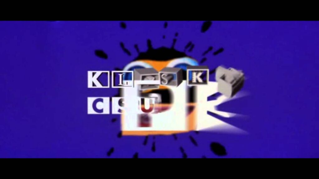
Deconstructing the Design: Elements and Symbolism
The Klasky Csupo logo isn’t just a random collection of shapes and colors; each element contributes to its overall impact. The robot head itself is a symbol of technology and innovation, reflecting the studio’s embrace of computer animation and its willingness to experiment with new techniques. The open mouth, seemingly frozen in a perpetual scream, conveys a sense of energy, excitement, and even a hint of chaos.
The color palette is equally significant. The bright, almost neon hues – the yellows, oranges, and reds – are intentionally jarring and attention-grabbing. They create a visual dissonance that is both unsettling and strangely appealing. This unconventional use of color further reinforces the studio’s image as a disruptor, challenging the established norms of children’s television.
The font used for the Klasky Csupo name is also noteworthy. It’s a bold, sans-serif typeface that conveys a sense of modernity and confidence. The letters are slightly distorted, adding to the logo’s overall sense of quirkiness and individuality. It’s a font that doesn’t take itself too seriously, perfectly complementing the playful nature of the robot head.
The Rugrats Revolution: How the Logo Defined an Era of Animation
While the Klasky Csupo logo appeared on numerous shows, it is perhaps most closely associated with Rugrats. The show’s immense popularity in the 1990s helped to cement the logo’s place in popular culture. For many viewers, the screaming robot head became synonymous with Rugrats and, by extension, with Nickelodeon itself.
The logo’s appearance at the end of each Rugrats episode served as a visual cue, signaling the end of the show and leaving a lasting impression on viewers. Its unique design and vibrant colors made it instantly recognizable, even to young children. The logo became a cultural touchstone, a symbol of a specific era of animation and a reminder of the shows that defined a generation.
Beyond Rugrats: A Legacy of Innovation and Influence
Klasky Csupo’s influence extended far beyond Rugrats. The studio was responsible for a wide range of other successful animated shows, including Aaahh!!! Real Monsters, Duckman, and Rocket Power. Each of these shows featured the Klasky Csupo logo, further solidifying its place in the animation landscape.
The studio’s innovative approach to animation also had a profound impact on the industry. Klasky Csupo was one of the first studios to embrace computer animation, pushing the boundaries of what was possible and inspiring other animators to experiment with new techniques. The studio’s willingness to take risks and challenge conventions helped to pave the way for a new generation of animated shows.
The Klasky Csupo Animation Style: A Visual Signature
Klasky Csupo’s animation style is as recognizable as its logo. Characterized by its angular designs, vibrant colors, and often surreal imagery, it set the studio’s productions apart. This style, a deliberate departure from the smoother, more rounded animation prevalent at the time, perfectly complemented the often-unconventional narratives of their shows. The characters often possessed exaggerated features and movements, adding to the overall sense of fun and absurdity.
The backgrounds were also distinctive, frequently featuring bold patterns and unconventional perspectives. This visual style, while not always universally appreciated, contributed to the unique atmosphere of Klasky Csupo’s shows. It was a style that dared to be different, and it resonated with a generation of viewers who were looking for something new and exciting.
The Enduring Appeal: Why the Klasky Csupo Logo Still Resonates
Even years after the studio’s heyday, the Klasky Csupo logo continues to evoke a sense of nostalgia and fondness. For many, it’s a reminder of their childhood, of Saturday mornings spent watching cartoons and of a time when animation was still fresh and exciting. The logo’s unique design and vibrant colors have made it instantly recognizable, even to those who may not be familiar with the studio’s work.
The logo’s enduring appeal also lies in its ability to capture a specific moment in time. It represents a period when animation was undergoing a significant transformation, when studios were experimenting with new techniques and challenging established conventions. The Klasky Csupo logo is a symbol of this era, a reminder of the creativity and innovation that defined it.
The Logo’s Evolution and Subtle Variations
While the “screaming robot” is the most iconic version, the Klasky Csupo logo wasn’t static. Subtle variations existed across different productions. The color saturation might be adjusted, the robot’s expression could appear slightly different, or the font might be tweaked. These variations, while often minor, reflect the evolving aesthetic sensibilities of the studio and the specific needs of each show.
Some shows even featured completely different versions of the logo, often incorporating elements specific to the show’s theme or setting. These variations demonstrate the studio’s willingness to experiment with its branding and to tailor its logo to the unique identity of each production. Even with these changes, the core elements of the logo – the robot head, the bold colors, and the quirky font – remained consistent, ensuring that it remained instantly recognizable.
The Logo in the Digital Age: Memes and Reinterpretations
The Klasky Csupo logo has found new life in the digital age, becoming a popular subject for memes and reinterpretations. Its unique design and jarring color scheme make it ripe for parody, and countless variations have appeared online, often incorporating humorous or subversive elements. This online presence has helped to keep the logo relevant and to introduce it to a new generation of viewers.
The logo’s enduring popularity online is a testament to its iconic status and its ability to resonate with a wide audience. It’s a reminder that even seemingly simple designs can have a lasting impact on popular culture and that even years after their creation, they can continue to inspire creativity and humor.
The Technical Aspects of Klasky Csupo Animation
Klasky Csupo wasn’t just visually distinctive; they were pioneers in integrating computer animation into their workflow. While early seasons of shows like Rugrats utilized traditional cel animation, later seasons and subsequent productions increasingly incorporated digital tools for coloring, compositing, and even creating character animation. This hybrid approach allowed for greater efficiency and flexibility, enabling the studio to produce more complex and visually dynamic animation.
Their early adoption of software like Toon Boom Opus (now Harmony) and other emerging animation tools gave them a competitive edge. They were able to experiment with different styles and techniques, pushing the boundaries of what was possible with computer-assisted animation. This technical expertise, combined with their distinctive visual style, helped to solidify Klasky Csupo’s position as a leading animation studio.
Klasky Csupo’s Influence on Modern Animation Styles
The impact of Klasky Csupo’s aesthetic can still be seen in many contemporary animated shows. Their willingness to embrace unconventional character designs, bold color palettes, and surreal imagery has influenced a new generation of animators. Shows like Adventure Time, Steven Universe, and Rick and Morty, while possessing their own unique styles, owe a debt to Klasky Csupo’s pioneering work.
Klasky Csupo demonstrated that animation didn’t have to be saccharine or overly polished. They showed that it could be edgy, subversive, and even a little bit weird. This opened the door for a wider range of styles and voices in animation, paving the way for the diverse and innovative landscape we see today. Their influence extends beyond just visual style; they also helped to normalize more complex and mature themes in children’s animation.
Remembering the Robot: A Lasting Impression
The Klasky Csupo logo is more than just a corporate symbol; it’s a cultural artifact. It represents a specific era of animation, a time of experimentation and innovation. Its unique design and vibrant colors have made it instantly recognizable, and its enduring appeal is a testament to its iconic status. For many, the screaming robot head is a reminder of their childhood, of Saturday mornings spent watching cartoons, and of the shows that defined a generation. The Klasky Csupo logo remains a powerful symbol of creativity, innovation, and the enduring power of animation.
